Graduate Portfolios
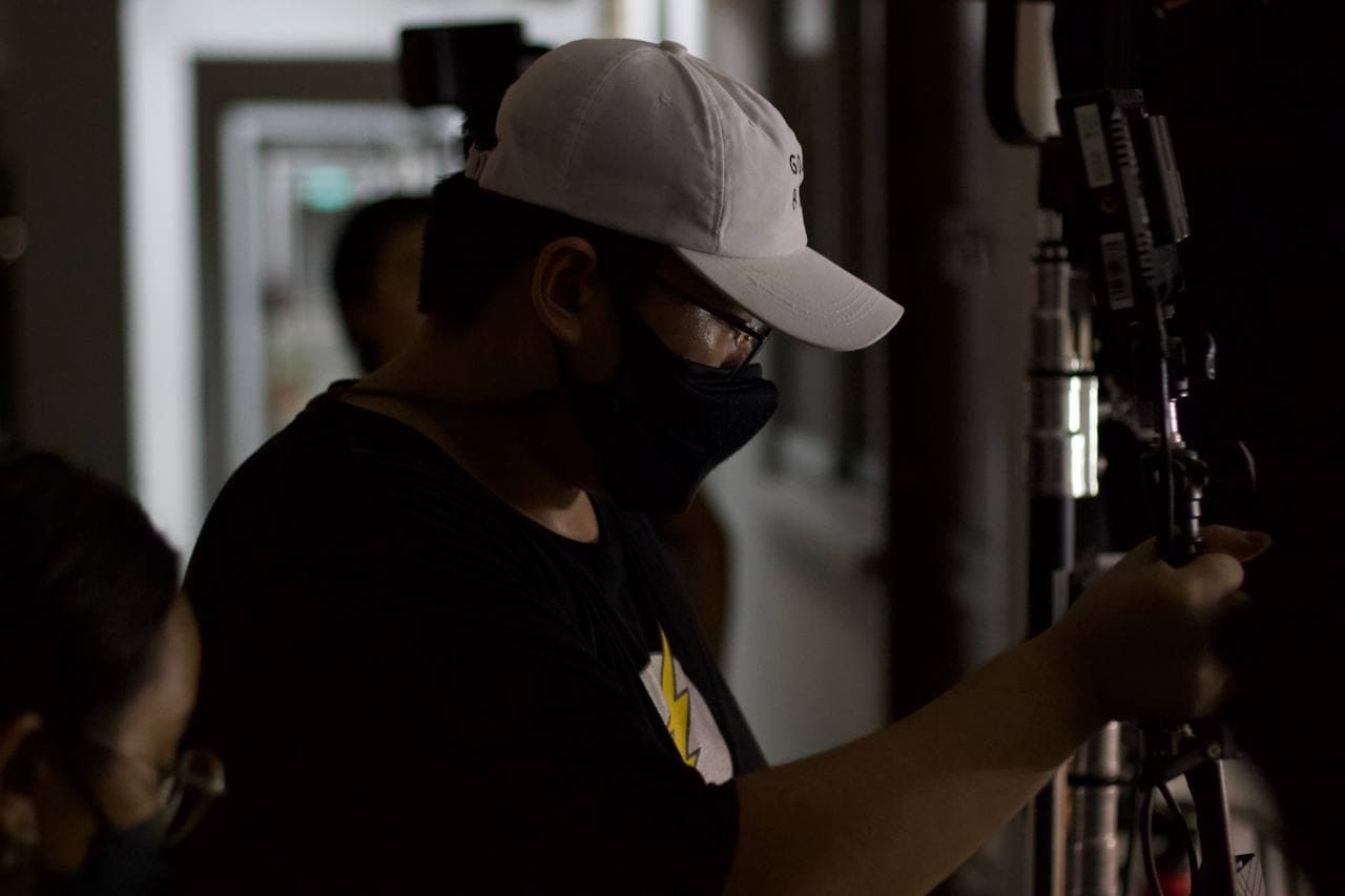
 Media Production
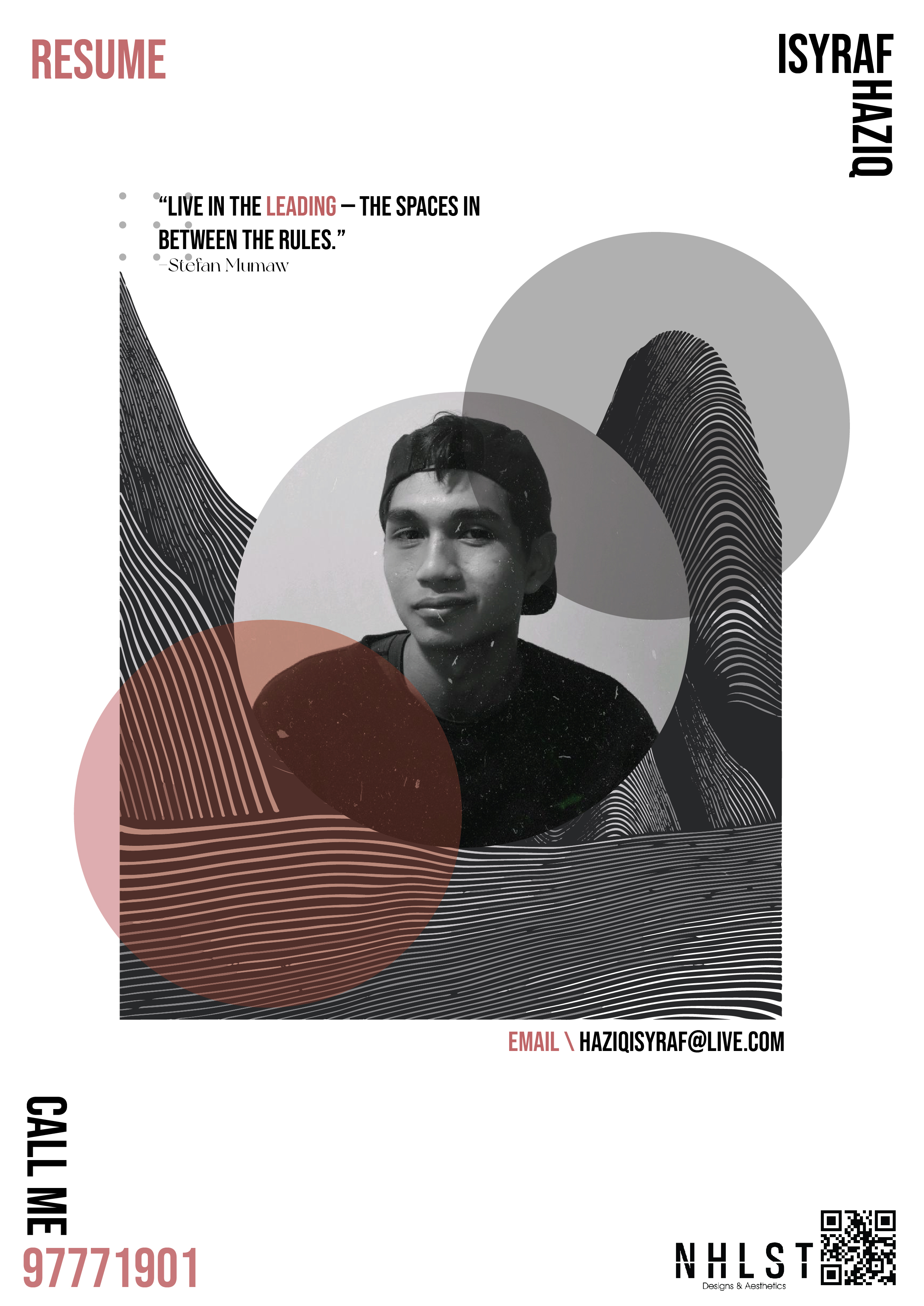
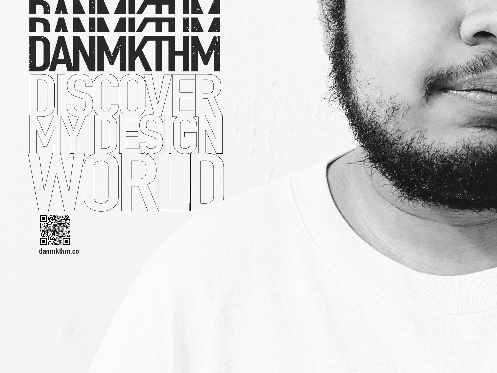
Khalisah Zulkiflie
Appreciate challenges and collaborative work that aids my learning process in the media industry. Currently fulfilling a Full-Time Job as an executive at Supreme Court.
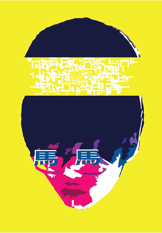
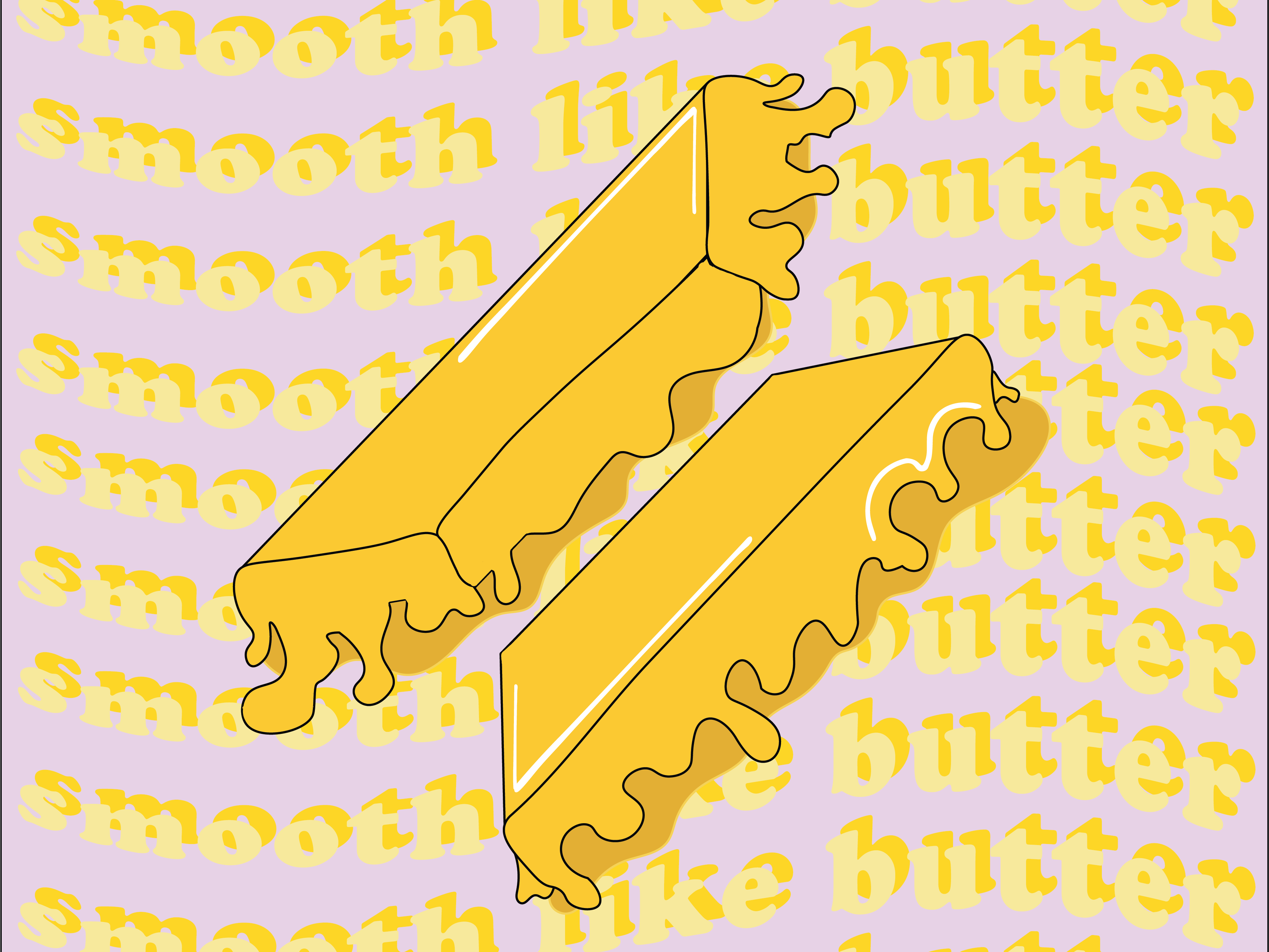 I will be honest, I love BTS. And as a fan, there's no better way to show my love than to redesign their album cover with my own style. One of their famous line is "smooth like butter" and of course the illustration of butter melting away are the main focus. Purple is BTS's official colour and lucky enough it's actually on the opposite spectrum of the colour wheel to Yellow making it contrasting yet appealing as well.
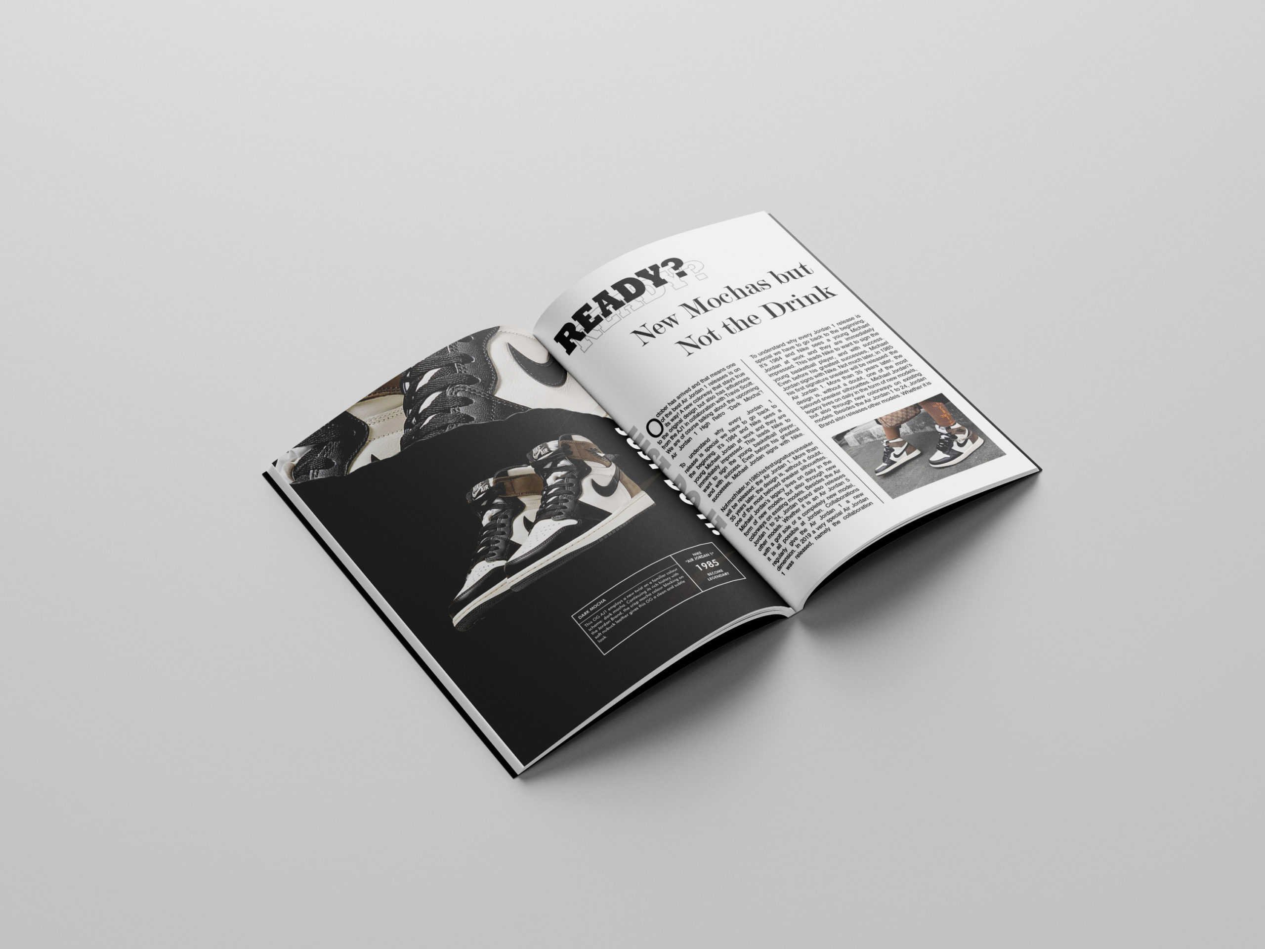 I believe double spread magazine pages are made for convenience but I did not want to take away important information or even the aesthetics. Due to the folding, I chose to connect only with Nike's Iconic tag phrase to let known that both are for each other. Texts being in the corner also help readers to focus on one area. I connected a childhood hobby of making coffee paper to the Nike's Mocha Jordans.
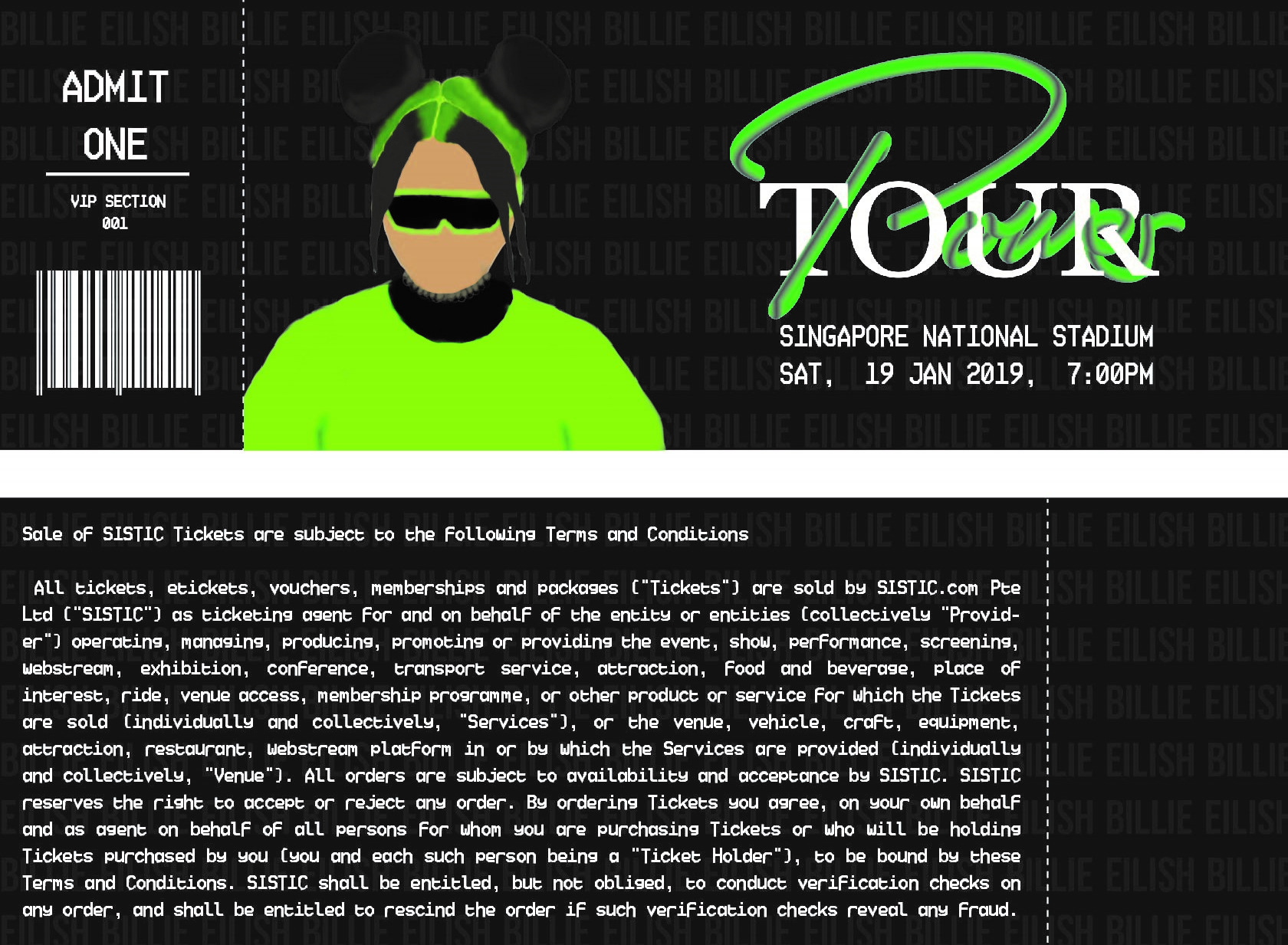 Whenever I go to a concert, I would love to keep a memoir of a ticket as it signifies the whole reason you're there. To be frank, a plain, white, & lazily thought through design is of course for convenience but a concert themed designed ticket will allow the fans to feel personally connected to the artiste. Billie's iconic colour is neon green and it isn't a Billie concert if there's no illustration of her on the ticket.
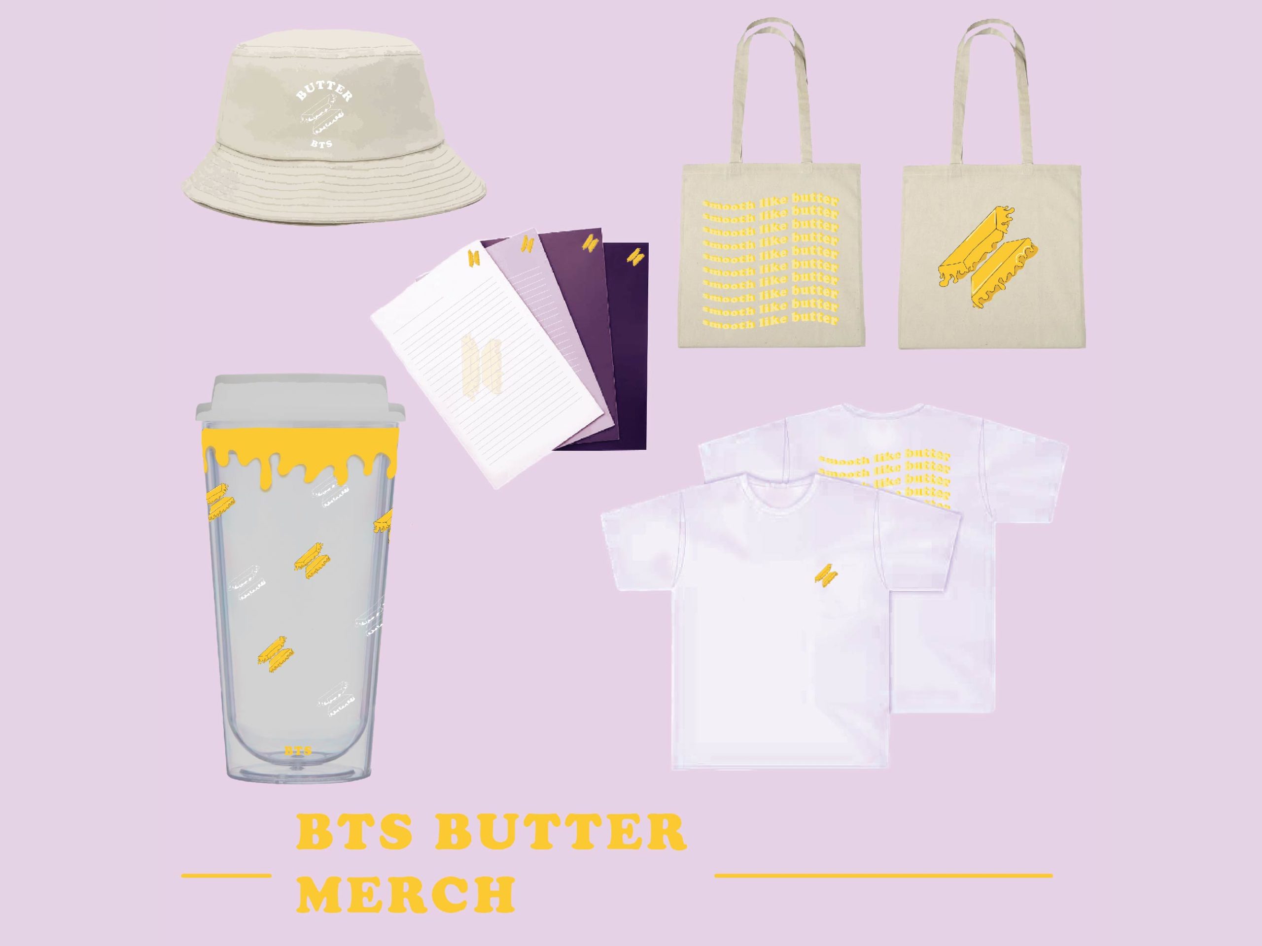 Following the Butter Single Cover, I believe that a fandom is not complete without their merchandise and upon being in one and doing quite a few researches, many prefer simple, minimalist and direct design. Something easy to spot as a fan outside but not too loud, screaming that you love the band. The choices of merch is also important and I chose what I think are the daily necessities.
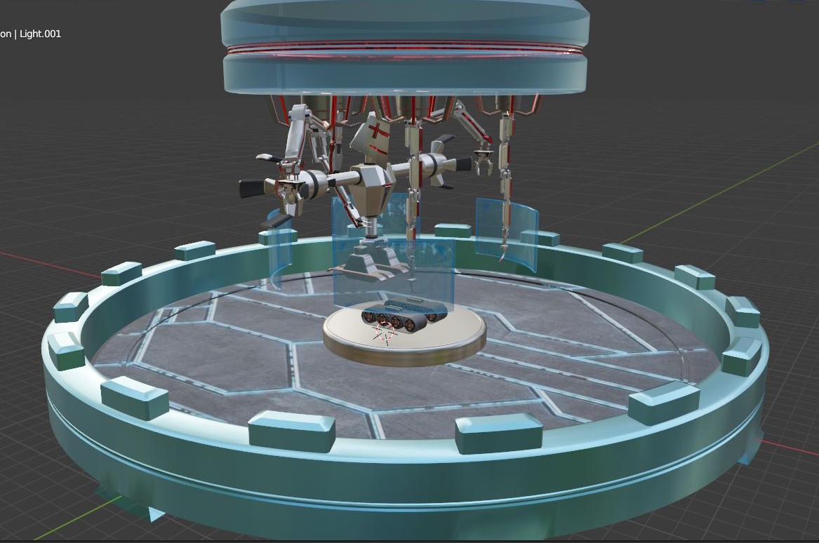
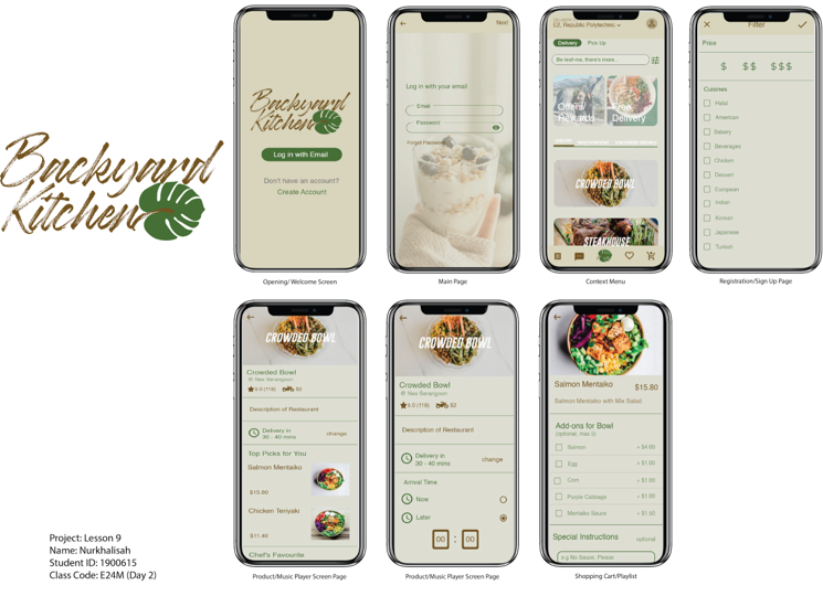 The concept behind the design and functionality was to implement a system where users will be able to enjoy healthy eating anywhere they are without worrying about what they are putting in their body. I incorporated the total number of calories there are in the food their eating. It is indeed meant for a very specific and targeted audience therefore using a colour palette that involves nature helps with efficient browsing.
Media Production more graduate portfolios
Connect with us

Copyright @ Republic Polytechnic, School of Technology of the Arts.
All Rights reserved.
Website designed by monSTArs.
All Rights reserved.
Website designed by monSTArs.